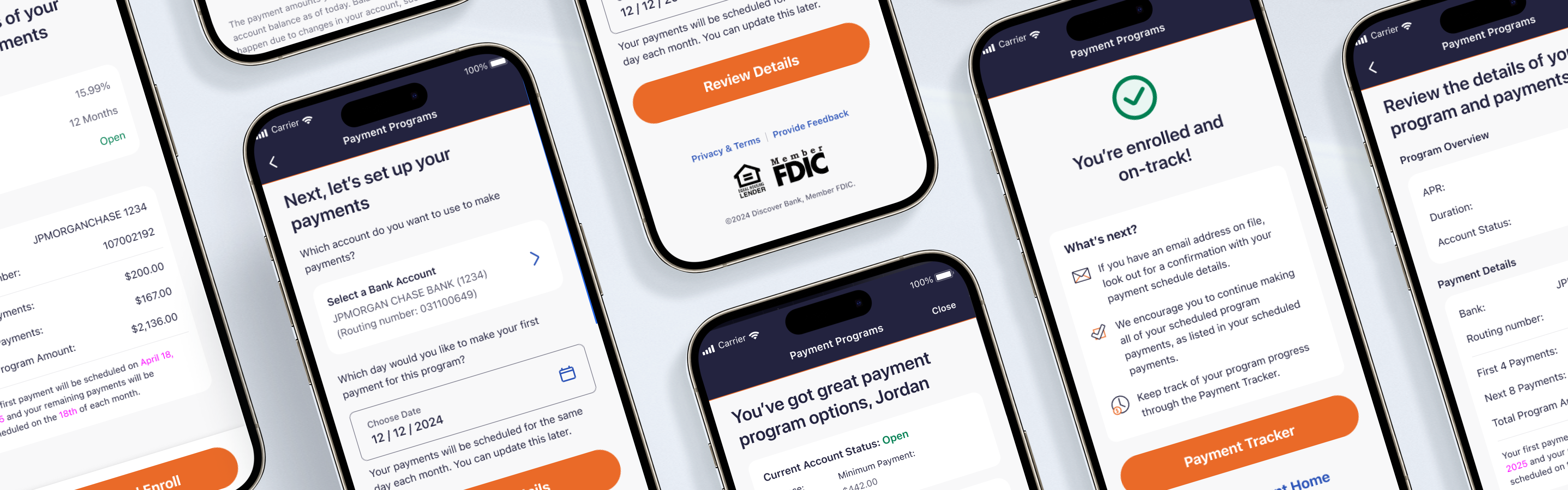
Discover Financial Services · Fintech · Enterprise
Bringing payment plan enrollment into the Discover mobile app.
Outcome
37.8%
Mobile conversion rate, surpassing web by +9.2 points
$17.5M
Annualized profit before taxes unlocked through improved enrollment
330M
Discover customers served
Timeline and Scope
8-month engagement
Q4 2025 launch
Team
My Role: Project Lead
1 Principal Designer
1 Content Designer
1 Design Researcher
BA & Product Owner
Mobile Development Team
Context
Collections & Repayment
Highly regulated financial space
330M customer base
$622B in annual transactions
Project Overview
Founded in 1985, Discover Financial Services is a leading digital banking and payment services company. In 2024, Discover processed approximately $622 billion in transactions across its payment networks, including Discover Network, PULSE, and Diners Club International, serving 330 million customers.
The Challenge
Goal: bring the full payment plan experience into the Discover mobile app in a way that feels native, intuitive, and supportive during what can be a stressful financial moment.
Customers who fell behind on their Discover credit card payments could only access payment plans through the website. Discover has a strong mobile customer base, and this disconnect created friction at a time when users were most vulnerable. Lack of native mobile access potentially increased the risk of charge-offs.
Our goal was to close this gap by bringing the experience into the mobile app, with a north star metric of unlocking up to $17.5M in annualized profit before taxes through improved engagement and enrollment in payment programs.
The Scope
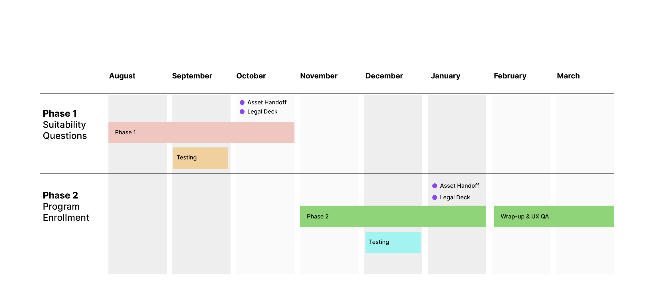
I collaborated with business and engineering to devise a staggered phased plan to expedite delivery.
- Phase 1 — Update legally required suitability questions. Customers must complete these before viewing their repayment offers.
- Phase 2 — Plan selection and enrollment. Designed to help users evaluate their options, understand which plan best fits their needs, and confidently enroll within the app environment.
AI Considerations
Project estimation and planning: AI tools could have accelerated scope definition by generating initial effort estimates based on similar past projects, flagging scope creep risks early, and auto-updating delivery timelines as requirements shifted. Tracking historical throughput across sprints and surfacing velocity trends would have given the team sharper data for stakeholder conversations about phasing and trade-offs.
Flows & User Journey
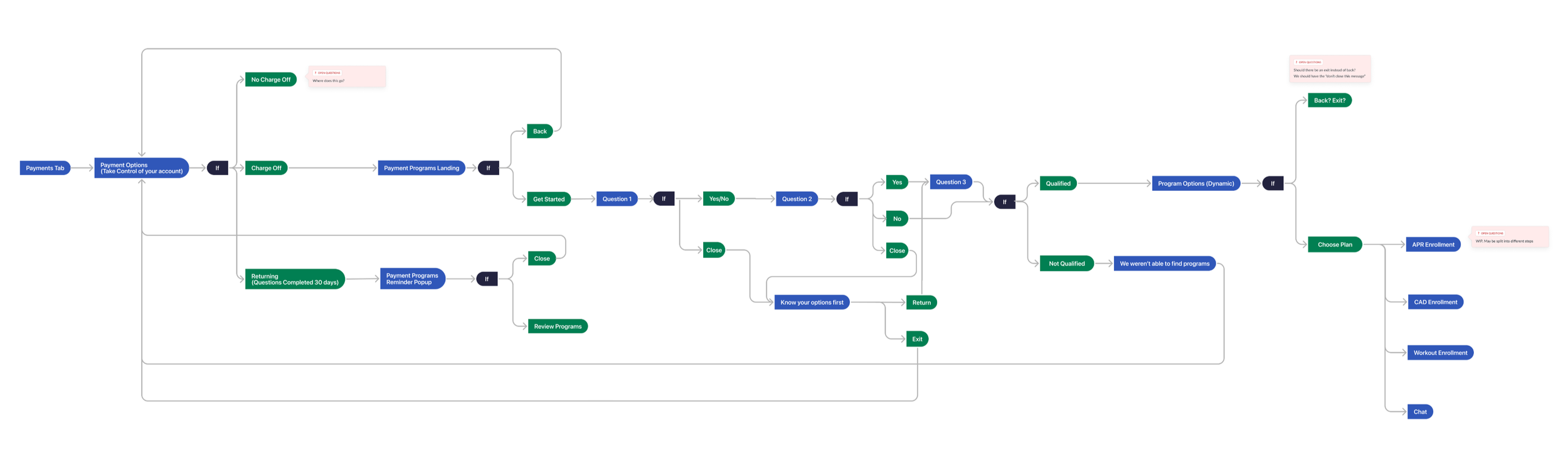
Led the team to create an abstracted overview of the Payment Programs user experience. This was done to: (1) help the design team build empathy on the overall experience and think beyond the narrow scope tasked to us by partners, and (2) align partners on the program details.
AI Considerations
Edge case mapping: With multiple delinquency states to design for, AI could have helped surface and stress-test edge cases earlier in the process — reducing reliance on manual documentation and accelerating alignment across engineering and legal.
Phase 1 — Suitability Questions
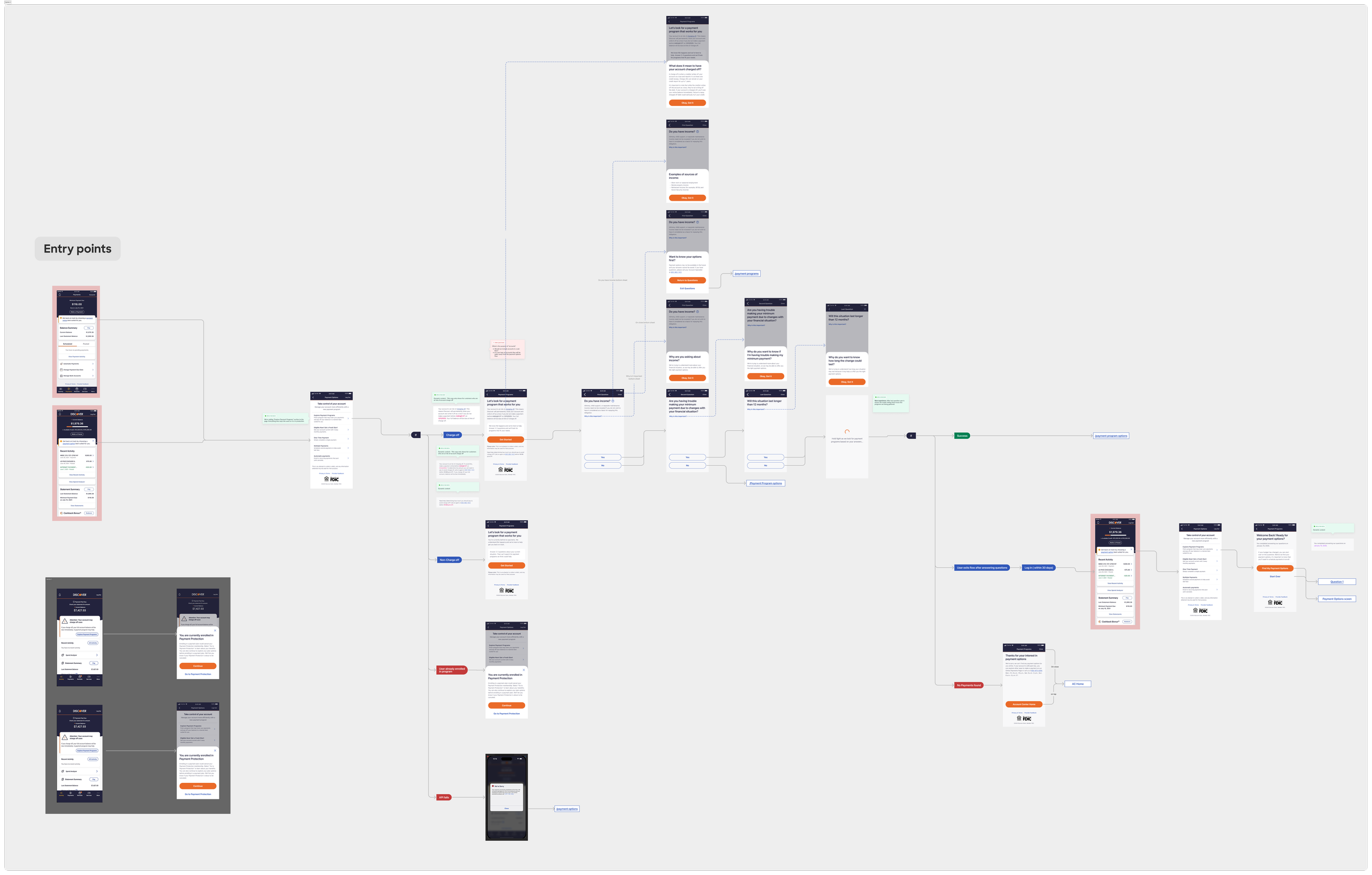
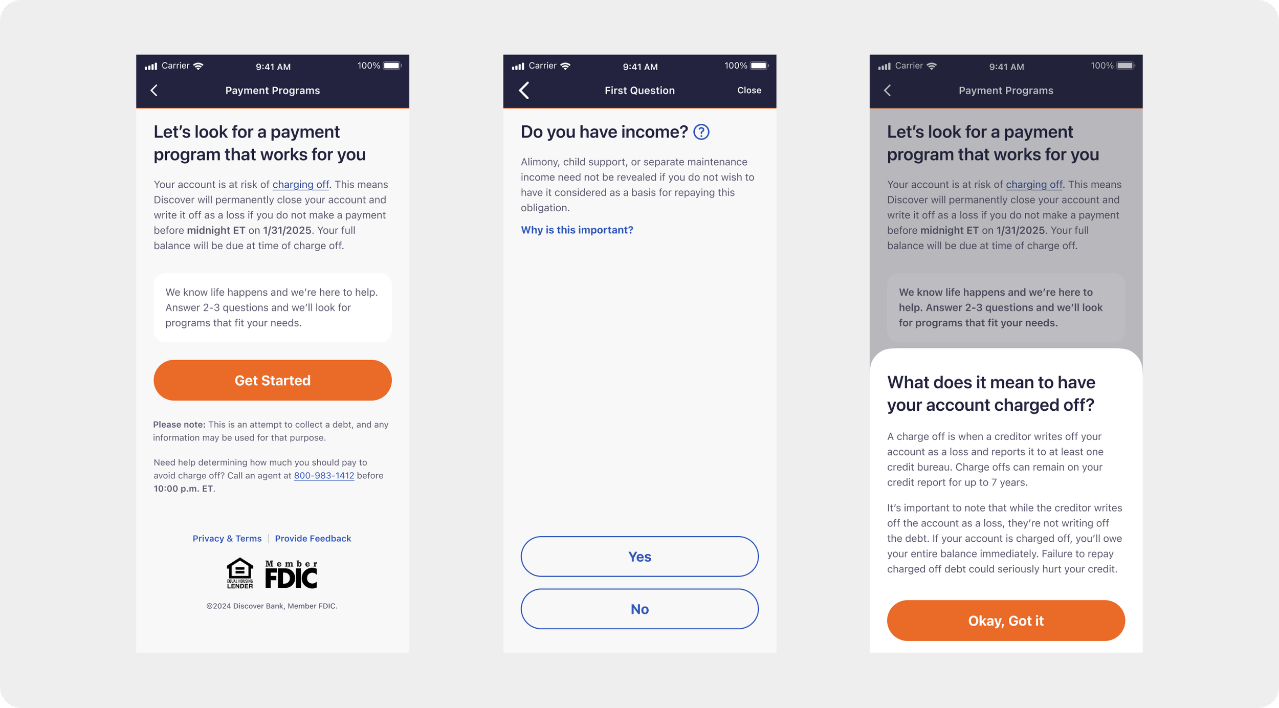
Due to legal requirements, customers were required to answer 2–3 suitability questions before viewing their available payment plans. While we couldn't remove these questions, we used clear typography, visual hierarchy, and contextual "read more" content to improve comprehension and reduce friction.
We designed the suitability section as an overall flow, not isolated screens. Knowing from past user testing that many customers didn't understand why they were being asked these questions, we partnered closely with content design to address those pain points — and built a strong case for eliminating the questions altogether in the future.
Phase 2 — Program Enrollment
The team designed with the pillars of simplicity, clarity, and quick comprehension — values central to Discover's brand and critical for users in distress.
Building with Systems in Mind
Discover has a robust Design System in place, and they are open to design contributions. We partnered with the systems team to craft reusable components — including tabular elements for the plan card, a chart-style layout optimized for small screens, and states for various delinquency levels so the experience adjusts based on customer eligibility.
Key Decisions
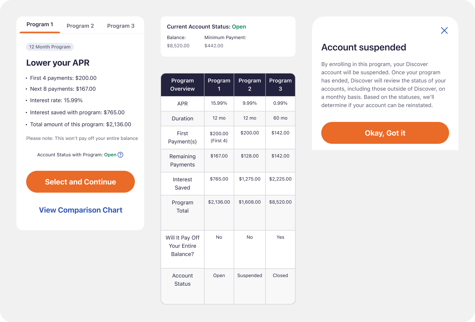
- Introduced a Quick View comparison chart allowing users to scan payment options side by side
- Created a flexible, mobile-first component in partnership with the design system team that displays duration, monthly amount, and total repayment
- Worked closely with engineering to map the UI to backend APIs, ensuring correct data auto-populates without friction
User Testing & Iteration
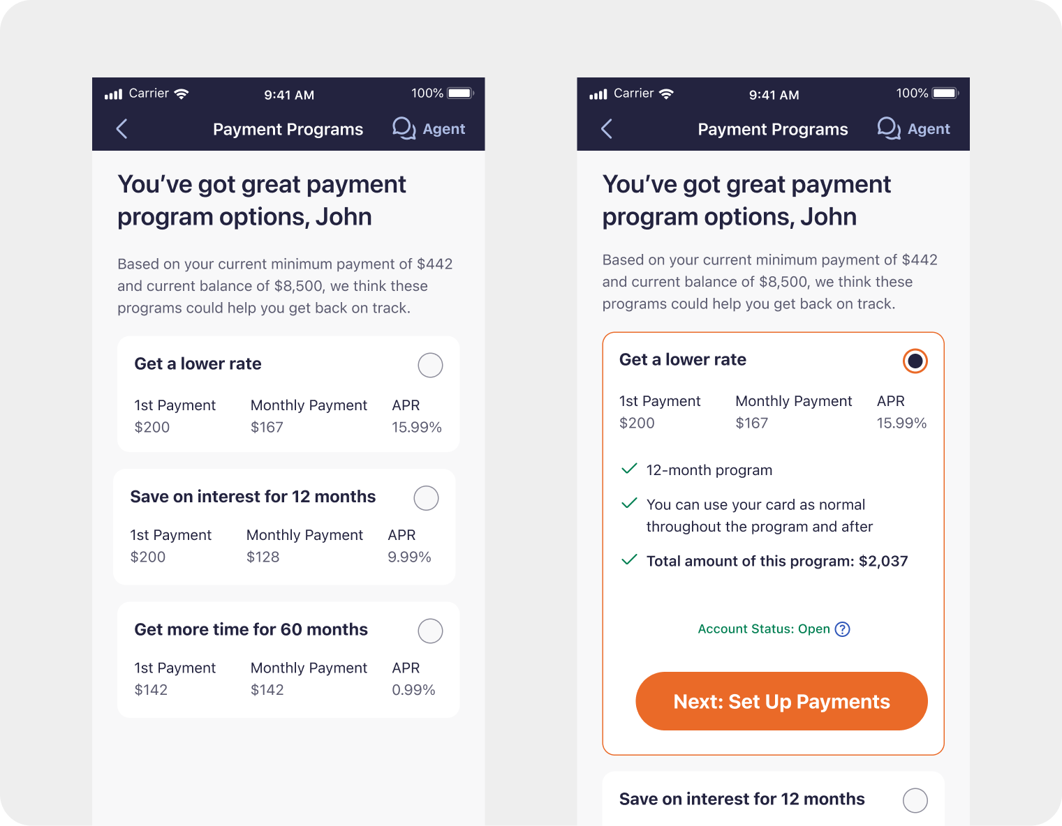
Over the course of 2 weeks, we conducted iterative, moderated user interviews to evaluate three distinct interaction models for program selection: radio buttons, stacked offers, and tabbed offers.
AI Considerations
- Rapid prototyping: AI-generated variations of the three program selection models — whether radio buttons, stacked options, or tabs — could have compressed the time from concept to testable prototype, letting us reach user feedback sooner.
- Research synthesis: AI-assisted pattern recognition across the moderated interview data would have accelerated how quickly we identified the winning UI direction, surfacing consensus signals across sessions in minutes rather than days.
- Design system contributions: AI tooling could have helped draft the component spec and edge-case state inventory we submitted to the systems team, reducing the back-and-forth with documentation.
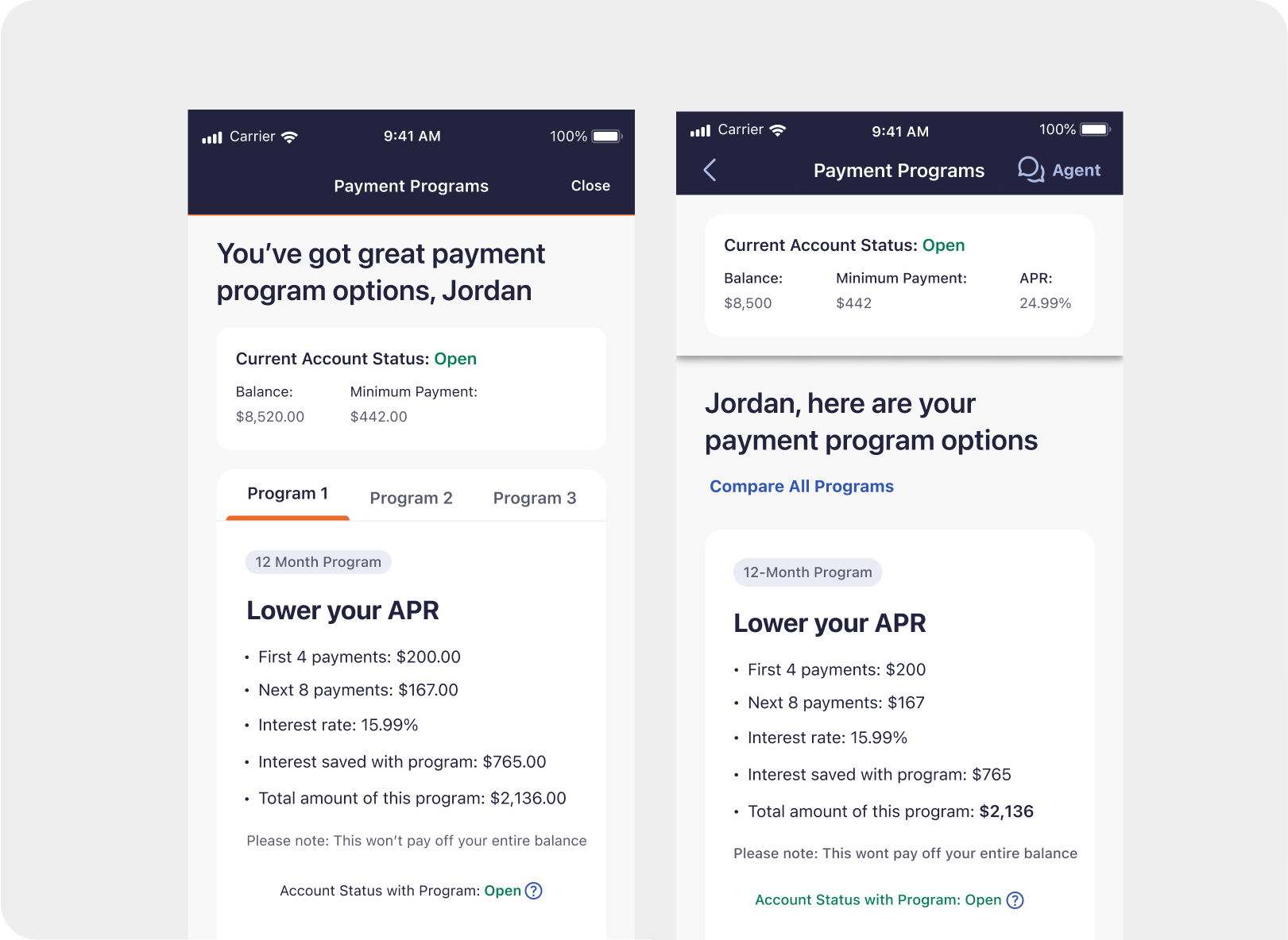
Of the three UI variations tested, the tabbed layout outperformed the others in both usability and user preference. Participants found it easiest to navigate and compare plans within a single view. Based on the overwhelmingly positive feedback, we prioritized keeping the comparison chart in the final design to support informed decision-making and maintain user confidence during selection.
Final Product & Results
The complete Payment Programs experience was handed off in Q3 2025 and launched in Q4 2025.
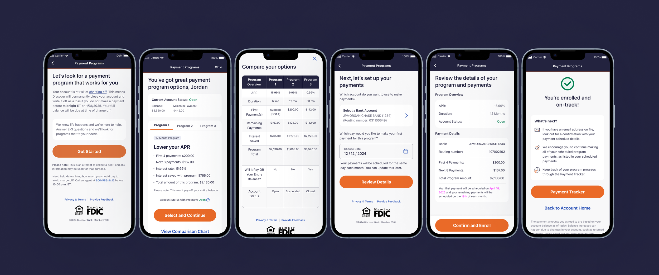
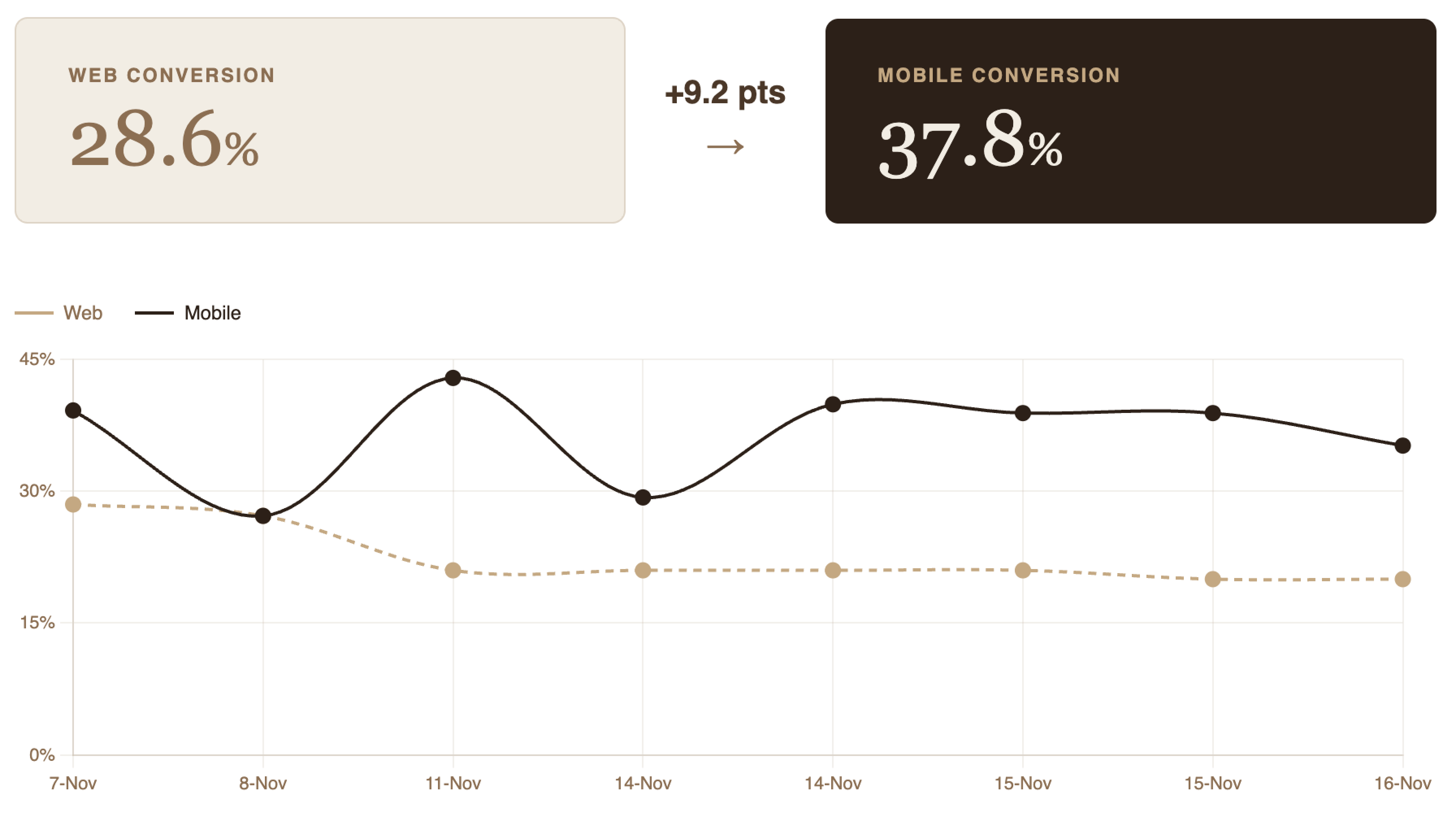
Once launched, mobile conversion surpassed web by +9.2 percentage points, reaching 37.8% compared to web's 28.6%. The sustained performance gap highlights the effectiveness of the mobile-first design in reducing friction and improving completion rates.